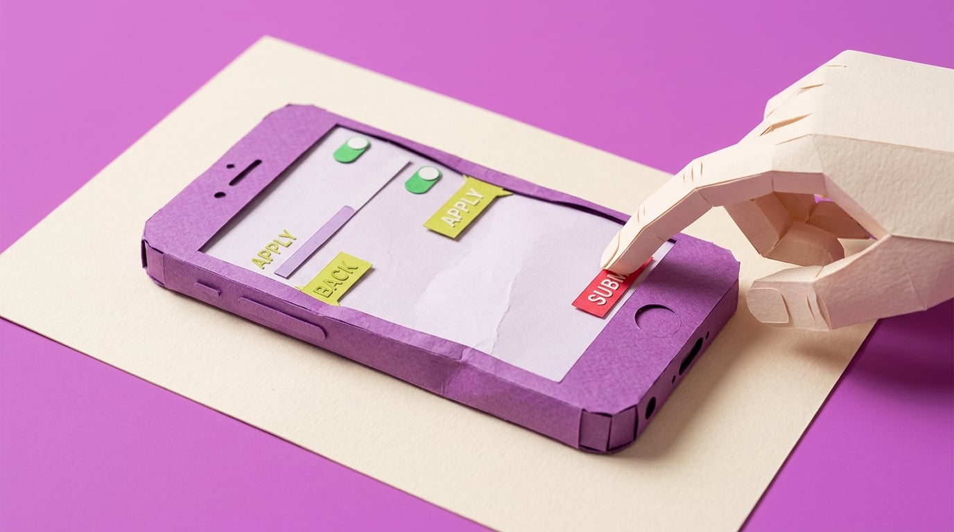
My Power App works in Studio, but the phone layout is a mess
A Power Apps maker has built a SharePoint-backed canvas app that works in Studio, but the layout falls apart when colleagues use it on phones, tablets, or smaller browser windows. The app may still submit data correctly, but clipped controls, awkward spacing, and hidden buttons make it feel unfinished and reduce user trust.
Blocker Reviewed by Helen Jones
Reviewed by Helen JonesContext
The blocker, in a nutshell
If this blocker is unfamiliar, start here.
Canvas apps give makers control over screens and controls, but responsive behavior depends on display settings, containers, dynamic sizing, and testing across device sizes.
Key Terms
Industry jargon explained
Click any term to see its definition.
The Reality
A day in their life
Business professional asked to build an internal Power App
I start the morning feeling pretty good because the request tracker finally opens, shows the SharePoint list, and lets me submit a new item. In Power Apps Studio, the screen looks tidy enough. I send the link to two people for a quick check before the team meeting.
By mid-morning, one person sends back a phone screenshot where the buttons are half off the screen. Another says the form is usable on their laptop but awkward on a tablet. I try dragging controls around, then realise every quick fix seems to break a different screen size.
The small win is that the app still works: the data saves, the gallery loads, and the approval flow is not the issue. The painful part is that nobody judges the app by the hidden working bits. They judge it by the first broken screen they touch.
What I want is a simple way to rebuild the layout once, test it on the devices we actually use, and know what 'good enough to pilot' looks like before I send the next link.
The People
Who experiences this blocker
Business professional asked to build an internal Power App
25-50 • Beginner to early intermediate Power Apps maker
Skills
Excel or Microsoft Lists confidence
Basic Power Apps screens and forms
Can copy and adapt simple formulas
Frustrations
- App looks fine in Studio but wrong on phone
- Containers feel fiddly
- Real users judge the app as amateur
Goals
- Ship an app colleagues use
- Avoid separate phone and tablet copies
- Create a repeatable layout checklist
Team manager
Wants the app to replace the spreadsheet and expects it to work for office and mobile users.
Also affected by this blocker. Often shares the same frustrations or creates additional pressure.
Top Objections
- I do not have time to redesign the whole app
- I thought Power Apps handled this automatically
- I am not a designer
How They Talk
Use These Words
Power Appscanvas appphone layouttabletcontainerscreenSharePoint list
Avoid
front-end architectureCSS frameworkresponsive breakpoint system
Learning Pathway
Power Apps UX Rescue
Make a working app feel usable on real devices.
Showing 2 of 2 recommendations
Course
Course Built
◆◆◆◆◆Excellent Fit
Fix phone and tablet layouts before users see the app
5 lessons120 minbeginner
You'll build: A repaired responsive screen plus a one-page device acceptance checklist.
Responsive containersScale to fit and orientation settingsPhone/tablet/browser checks+2 more
Briefing
Briefing Built
◆◆◆◆◇Good Fit
Check a Power App layout before mobile users see it
You'll build: A completed mobile layout review checklist for one app.
Root Cause
Finding where this blocker actually starts
We traced backward through five layers of "why" until we hit the source. Here's what's really driving this.
1
Why do users see a broken layout?
The app was arranged for the maker's current screen size rather than tested against the devices and browser sizes real users will use.
2
Why was it arranged for one screen size?
The builder used fixed X, Y, Width, and Height values or nested containers without a consistent responsive pattern.
3
Why did the builder not catch it earlier?
Previewing in Studio creates a false sense of completion unless the maker also tests phone, tablet, browser, portrait, landscape, and scroll states.
4
Why is responsive design hard for this avatar?
Power Apps containers have their own properties, parent references, wrapping, overflow, and child-control behavior, which is a UI system rather than a simple drag-and-drop surface.
5
Why does this persist across apps?
There is no lightweight release checklist that turns responsive layout from an artistic judgement into a repeatable maker workflow.
Root Cause
The visible failure is a broken mobile layout, but the root cause is an absent responsive layout workflow: device targets, container rules, dynamic sizing, scroll behavior, and acceptance tests are not defined before the app is shown to users.

The Numbers
How this stacks up
Key metrics that determine the opportunity value.
Overall Impact Score
88/100
Urgency
8.6/10
They need this fixed now
Build Difficulty
8.8/10
Complex, needs deep expertise
Market Size
7.8/10
Healthy demand exists
Competition Gap
8.4/10
Major gap in the market
"side by side on a PC, but stacked vertically on a mobile phone or tablet"
Beginner asking how to make two containers adapt across desktop and mobile. — Reddit r/PowerApps responsive layout question, 2026-02-01
More Evidence
What others are saying
"supporting two separate copies gets painful quickly"
Practitioner warning against separate phone/tablet app copies; older but useful as a durable maintenance-pattern signal. — Reddit r/PowerApps responsive layout discussion, 2023-05-26
"displays properly in studio play, but just not on my phone"
Maker debugging a layout that behaves differently on a real phone; older but still mechanism-aligned. — Reddit r/PowerApps mobile display issue, 2024-07-03
The Landscape
What solutions exist today?
Current market solutions and where there are opportunities.
Leader
M
Microsoft responsive canvas app documentation
Approach: Explains responsive principles, display settings, containers, and known issues.
Weakness: Useful as mechanism evidence, but not packaged as a practical repair sprint for a non-developer with an existing messy app.
Y
YouTube responsive layout tutorials
Approach: Demonstrate responsive containers and templates visually.
Weakness: Often teach from a clean demo app rather than a half-built SharePoint app with inherited fixed-size controls.
The Gap
Why existing solutions keep failing
The pattern they all miss — and how to beat it.
Common Failure Mode
Most beginner materials teach how to add containers, but the paid pain sits in converting a nearly finished internal app into something that real phone and tablet users can actually use.
How to Beat Them
Teach a repair workflow anchored in the learner's own app, with clear pass/fail proof for device states.
The Fix
What a solution needs to succeed
The non-negotiables and nice-to-haves for any product or service tackling this blocker.
The 3 Wishes
Turn a working but awkward canvas app into a layout that behaves predictably on desktop, tablet, and phone.
Must Have
Device target worksheet
Container repair pattern
Pass/fail mobile checklist
Before/after screenshot proof
Nice to Have
Example screen template
Common container mistakes list
Out of Scope
Full redesign service
Native mobile app development
Dataverse migration
Success Metrics
The first screen passes phone and tablet preview
No primary action is clipped or hidden
The maker can repeat the checklist on another screen
Solution Strategy
Which approach fits you?
A briefing can help diagnose layout readiness; a course is stronger because the learner must practise rebuilding and testing a real screen.
What we recommend
Start with an atomic course plus a downloadable device checklist.
The Future
What might make this blocker obsolete
Technologies and trends that could disrupt this space. Factor these into your timing.
medium probability
12 months
Power Apps keeps improving responsive building blocks
Course should stay tied to current container behavior and known issues.
SaaS: Medium risk
Course: Low risk
Consulting: Low risk
Content: Medium risk
For Creators
Content Ideas
Marketing hooks, SEO keywords, and buying triggers to help you create content around this blocker.
Buying Triggers
Events that make people search for solutions
- First pilot user sends a broken mobile screenshot
- Manager asks why the app looks unfinished
- The builder needs one app to work across laptop and phone
Content Angles
Attention-grabbing hooks for your content
- Why your Power App looks fine in Studio and awful on a phone
- The responsive container checklist before you pilot
- Stop making separate phone and tablet versions of the same app
- The layout test your users wish you had run
Search Keywords
What people type when looking for solutions
Power Apps mobile layoutPower Apps responsive containersPower Apps phone layout brokenPower Apps app works in studio not phone
The Evidence
Where this came from
Every claim in this report is backed by public sources. Verify anything.
1.2.3.4.5.
Power Apps responsive layout for containers PC vs mobile
reddit.com
Responsive layout for mobile and tablet
reddit.com
Screen not displaying correctly in PowerApps Mobile App
reddit.com
Building responsive canvas apps
learn.microsoft.com
ZF Group builds manufacturing efficiency with over 25,000 apps on Power Platform
microsoft.com
5 sources referenced
Source note
Blocker published by Collab365 Spaces, reviewed by Helen Jones on . Cite as "My Power App works in Studio, but the phone layout is a mess", Collab365 Spaces. 5 sources referenced.
Have a question or correction?
No comments yet