My Power App works, but everyone says it looks ugly
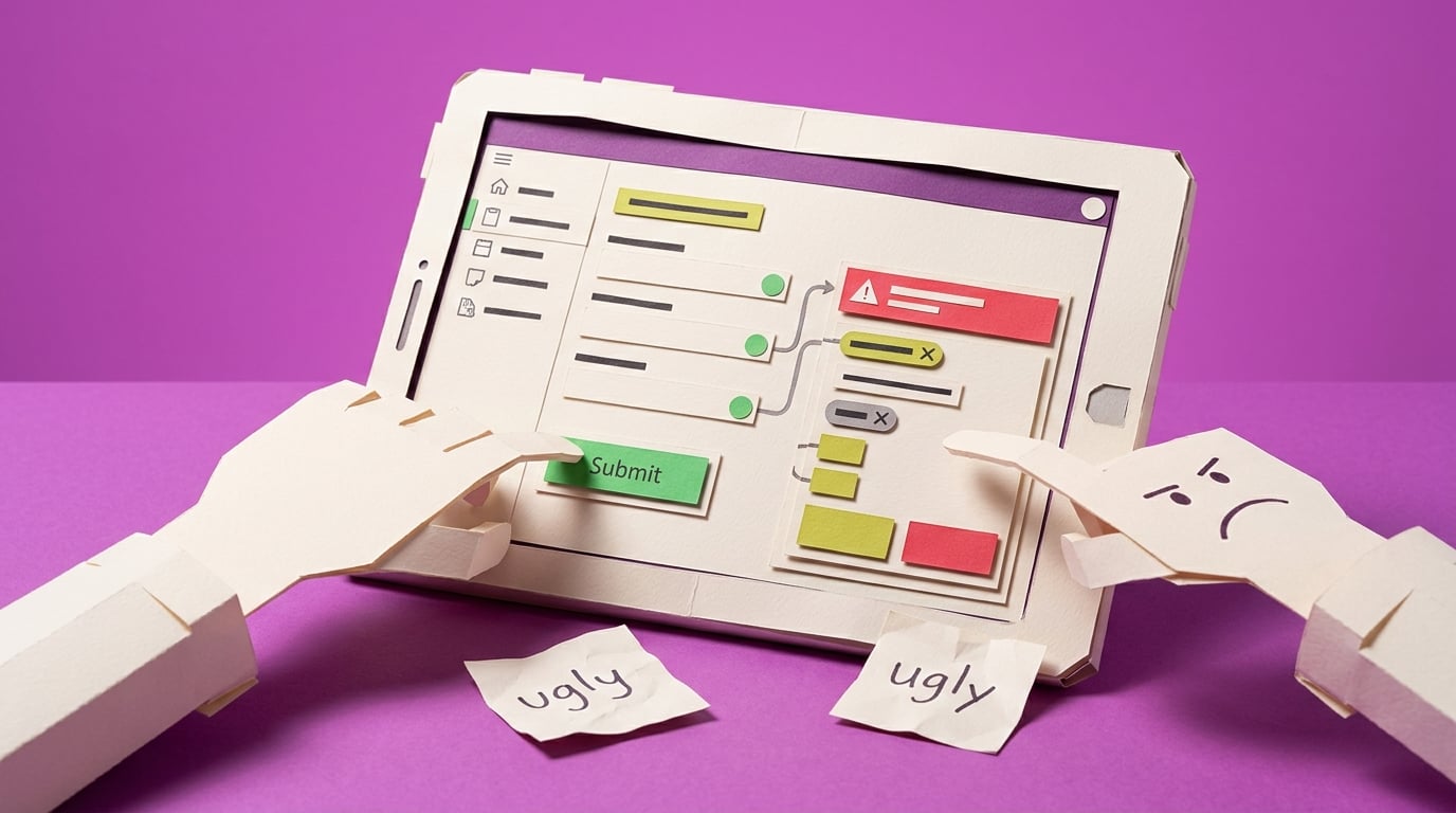
A non-developer maker has built an app that technically works, but users call it ugly or avoid it because the UI does not feel trustworthy. The consequence is adoption drag after the builder has already done the functional work.
Blocker Reviewed by Helen Jones
Reviewed by Helen JonesContext
The blocker, in a nutshell
If this blocker is unfamiliar, start here.
Power Apps canvas apps give makers design freedom, but non-designers need constraints around spacing, hierarchy, controls, and state feedback to avoid rough-looking internal apps.
Key Terms
Industry jargon explained
Click any term to see its definition.
The Reality
A day in their life
Business professional asked to build an internal Power App
I start the day with a working app, which should feel like a win. The SharePoint list is connected, the form submits, and the manager can finally see the request status without asking me to update a spreadsheet.
Then the first user feedback lands. It is not about the approval flow or the data. It is about how the app looks. One person says it feels clunky. Another says the old spreadsheet was easier to scan. I spend my lunch break changing colors and button sizes, but it still feels random.
The small win is that I now know the workflow can be digitized. The frustrating part is that visual quality has become the blocker, and I do not have a designer or developer coming to rescue it.
What I want is a practical standard for making this app look calm, consistent, and usable enough that people judge the process, not my rough screen design.
The People
Who experiences this blocker
Business professional asked to build an internal Power App
25-50 • Beginner to early intermediate Power Apps maker
Skills
Can build forms and galleries
Understands the business process
Basic Microsoft 365 confidence
Frustrations
- The app works but looks amateur
- Design advice feels too abstract
- Every screen has different spacing
Goals
- Make apps colleagues trust
- Avoid hiring a designer for every internal tool
- Create reusable screen patterns
Process owner or manager
Wants users to adopt the new app and stop using the old spreadsheet or email chain.
Also affected by this blocker. Often shares the same frustrations or creates additional pressure.
Top Objections
- I am not a designer
- I do not want to rebuild the whole app
- Modern controls feel like another thing to learn
How They Talk
Use These Words
Power Appscanvas appmodern controlsthemebuttonscreengallery
Avoid
design system governanceFluent implementation strategypixel-perfect UI
Learning Pathway
Power Apps UX Rescue
Make internal apps feel usable enough for real teams.
Showing 2 of 2 recommendations
Course
Course Built
◆◆◆◆◆Excellent Fit
Polish a working Power App so users trust it
5 lessons150 minbeginner
You'll build: A before/after polished core screen and a reusable UI polish checklist.
Visual hierarchyModern controls and themesSpacing and alignment+2 more
Briefing
Briefing Built
◆◆◆◆◇Good Fit
Check whether a canvas app looks professional enough to pilot
You'll build: A prioritized UI fix list for one app.
Root Cause
Finding where this blocker actually starts
We traced backward through five layers of "why" until we hit the source. Here's what's really driving this.
1
Why do users call the app ugly?
The app has inconsistent spacing, dated default controls, unclear hierarchy, and too many visual decisions made one control at a time.
2
Why are visual decisions inconsistent?
The maker built for function first and did not create a theme, screen pattern, or reusable visual rules before adding screens.
3
Why did function-first feel reasonable?
Power Apps tutorials often reward getting a working form or gallery, while design polish feels optional until users react.
4
Why does poor UI reduce adoption?
Users read visual quality as a trust signal; an app that looks rough feels risky, slow, or temporary even when it saves correctly.
5
Why does the problem repeat?
Each new app starts from blank screens or templates without a lightweight, business-friendly UI polish checklist.
Root Cause
The app is not rejected because it lacks another feature. It is rejected because the builder has no small, repeatable design system for spacing, hierarchy, controls, states, and navigation cues.

The Numbers
How this stacks up
Key metrics that determine the opportunity value.
Overall Impact Score
84/100
Urgency
8.2/10
They need this fixed now
Build Difficulty
9/10
Complex, needs deep expertise
Market Size
7.6/10
Healthy demand exists
Competition Gap
8.6/10
Major gap in the market
"the feedback I got from users is that... the app is ugly"
Maker asking how to make a Power App more attractive after user feedback; older but directly aligned with the validated pain pattern. — Reddit r/PowerApps UI feedback discussion, 2025-03-18
More Evidence
What others are saying
"stuck maintaining ugly looking and poor performing UX apps"
Practitioner describing inherited apps with poor UX and maintenance burden; older/contextual evidence. — Reddit r/PowerApps poor UI discussion, 2024-11-14
"well crafted... Reports and Apps embed more easily into business, and actually last"
Community comment connecting design quality with business adoption; older/contextual evidence rather than quantified adoption proof. — Reddit r/PowerApps poor UI discussion, 2024-11-14
The Landscape
What solutions exist today?
Current market solutions and where there are opportunities.
Leader
M
Modern controls and themes in canvas apps
Approach: Microsoft explains modern controls and Fluent-based theming.
Weakness: Mechanism documentation does not teach a polish workflow for a messy real app.
P
Power Apps UI tutorial videos
Approach: Creators show attractive examples and component-style layouts.
Weakness: Often aspirational; beginners still need a constrained pattern they can apply without becoming designers.
The Gap
Why existing solutions keep failing
The pattern they all miss — and how to beat it.
Common Failure Mode
The gap is not lack of UI inspiration; it is a constrained, repeatable polish workflow for non-designers building internal apps under time pressure.
How to Beat Them
Start with one high-traffic screen, reduce choices, apply a simple style system, and use user feedback as the proof point.
The Fix
What a solution needs to succeed
The non-negotiables and nice-to-haves for any product or service tackling this blocker.
The 3 Wishes
Make the app look professional enough that users trust it without needing a full redesign.
Must Have
Before/after screen audit
Simple theme rules
Spacing and hierarchy checklist
Primary-action pattern
Nice to Have
Modern controls notes
Reusable header/action examples
Out of Scope
Advanced components
External design tools
Full brand system
Success Metrics
One core screen passes the polish checklist
Users can identify the main action
The maker has a repeatable style guide
Solution Strategy
Which approach fits you?
A checklist can diagnose rough UI, but a course is better for building the judgement to repair it.
What we recommend
Create an atomic UI rescue course with a short checklist/template pack.
The Future
What might make this blocker obsolete
Technologies and trends that could disrupt this space. Factor these into your timing.
medium probability
12 months
Modern controls keep changing the default visual baseline
Course should stay current with modern controls and theming behavior, but the core polish workflow remains useful for existing apps.
SaaS: Medium risk
Course: Low risk
Consulting: Low risk
Content: Medium risk
For Creators
Content Ideas
Marketing hooks, SEO keywords, and buying triggers to help you create content around this blocker.
Buying Triggers
Events that make people search for solutions
- Pilot users criticize the app's appearance
- The manager wants a more professional demo
- The builder is tired of random styling changes
Content Angles
Attention-grabbing hooks for your content
- Your Power App works, but users still do not trust it
- The non-designer UI checklist for Power Apps
- Stop polishing colors randomly in Power Apps
- Make one Power App screen look professional this afternoon
Search Keywords
What people type when looking for solutions
Power Apps ugly UIPower Apps modern controlsPower Apps app looks professionalPower Apps UI design for beginners
The Evidence
Where this came from
Every claim in this report is backed by public sources. Verify anything.
5 sources referenced
Source note
Blocker published by Collab365 Spaces, reviewed by Helen Jones on . Cite as "My Power App works, but everyone says it looks ugly", Collab365 Spaces. 5 sources referenced.
Have a question or correction?
No comments yet