Teams moves meeting buttons to reduce accidental shares and exits
 Reviewed by Helen Jones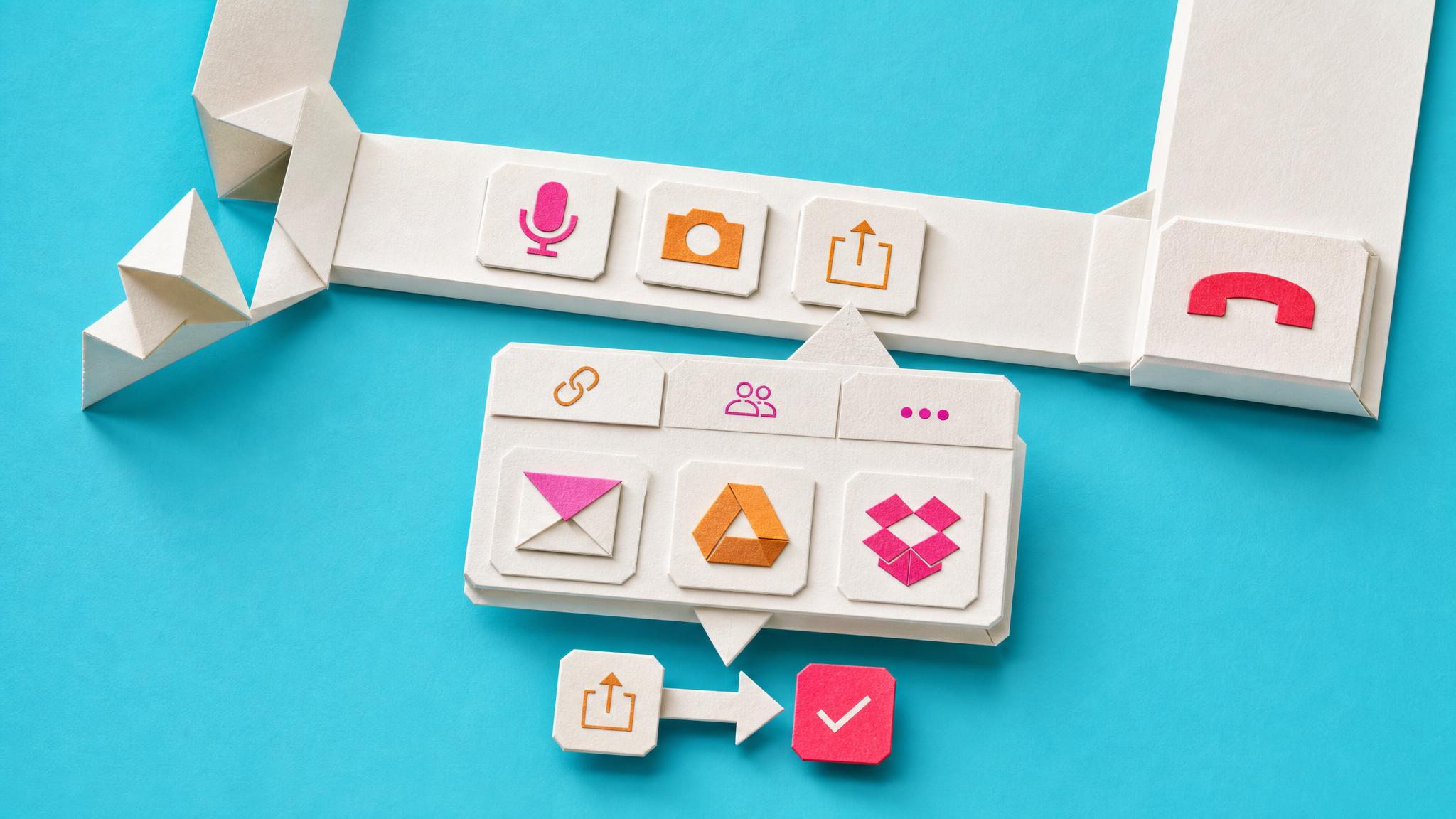
Microsoft is rolling out a simplified meeting toolbar in Teams. Microphone, camera and share buttons now sit together in the center. The Leave button stands alone. Less-used controls move behind a More menu. A redesigned share panel adds live previews, tabs, and a two-step confirmation before content appears. The change reaches Windows, Mac and web clients by the end of August 2026. Existing pinning policies stay in place. Admins can still lock two apps to the main bar.
Until now the meeting window has been a crowded set of controls that forced users to hunt for the right button while trying to stay present in the conversation. The layout change removes some of that visual noise but keeps the same underlying problem: everything still happens inside the meeting pane. The deeper shift is that Microsoft is accepting the meeting window as a permanent workspace rather than a temporary interruption. For people already juggling email, chat, and task lists, this means one more surface that needs to be managed instead of one less distraction to escape.
Analysis
This is a small relief that still leaves the meeting window as another inbox to watch. Test the new layout in your next recurring meeting, then decide whether to pin your two most-used tools or leave the defaults so the interface does not quietly add another layer of scanning.
Source note
Pulse published by Collab365 Spaces, reviewed by Helen Jones on . Cite as "Teams moves meeting buttons to reduce accidental shares and exits", Collab365 Spaces. 1 source referenced.