Build a Starter Component Library for Your Team's Power Apps
Stop copying the same header, menu, dialog, and badge onto every canvas app screen.
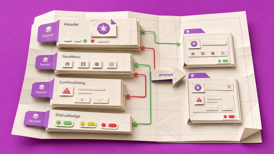
How does this Blueprint help you? V1 builds a published Power Apps canvas component library named `TeamUI` containing four components: `Header`, `NavMenu`, `ConfirmDialog`, and `StatusBadge`. A non-developer maker builds it from a logo file, three brand colour values, and a menu item list, then imports those shared components into two test canvas apps.
Why this exists
Microsoft documents component libraries as the recommended way to reuse canvas components across apps in the same environment, with makers alerted when published component updates are available. The earlier import/export feature is retired. This build turns that capability into a repeatable starter library and proof path.
Who will use it
A Power Apps canvas-app maker who maintains multiple team apps where the same header, menu, confirmation popup, and status styling have been copied by hand across screens and apps.
Blocker it removes
The maker currently changes a logo, menu label, colour, or status badge by editing many screens across many apps, which creates missed screens, inconsistent navigation, broken copied formulas, and no reliable way to prove that two consuming apps received the same shared UI update.
V1 proof
One logo change in `TeamUI.Header` is saved with version note `MVP proof logo update`, published, reviewed, and accepted in `TeamUI Consumer A` and `TeamUI Consumer B` so both apps show the new logo without direct screen edits.
How this Blueprint becomes a working result.
A Blueprint is the plan for creating a named result. A Course teaches; a Briefing helps you decide.
This is a platform build plan, not a finished or downloadable application.
You know your way around the tools you use at work. AI coaches you through anything new.
You remain responsible for the result. You create and test every screen, list, permission, and flow, with AI coaching you through the work.
AI is the guide, not the builder. AI can explain steps and draft formulas. It cannot access or change your tenant, data, permissions, or sharing settings.
Stuck on a question? Just ask. If anything in the guided session is unclear, tell the AI. It explains, gives examples, and helps you answer before moving on.
Before you begin
A platform licence, maker permission, an approved test location, and sample data. Get a builder estimate before you approve or commit to the work.
Start safely
Build privately with fictional data. Get approval before live data, wider sharing, publishing, or rollout.
New to agentic AI tools?
A Blueprint runs inside an agentic AI tool such as Claude Cowork or Codex, where the AI reads the whole Blueprint and works through it with you. If you have never used one, our free plain-English guide gets you comfortable first.
Read the AI for Work guideMember access
Ready to put this Blueprint to work?
You can review the result, audience, proof, responsibilities, and safe starting boundary here. Unlock Power Apps Builders to use the complete Blueprint.
The technical build sections and copyable implementation packet remain protected until access is unlocked.